
SCATS Traffic System
Project Overview
Role: UX/UI designer
Design team: Peter Franc, Will Choi, Audrey Xu
Time: 1 year and 6 months (33 Sprints)
Tools: Figma, Jira, confluence, Miro, Productboard, MS forms, Maze
Project description: We were hired as a design squad to redesign SCATS UI, which existed in the late 80s. There are many different products under SCATS, but we are working on one of the products called TCO-Traffic control operations. (Name yet to be confirmed)
What’s about.
SCATS is a computerized traffic management system used to control traffic lights in Sydney, Australia, and other cities around the world. However, the UI hasn’t been updated probably since the late 90 – earlier 2000. The average training is up to 6 months to a year for a person to understand the basics. And most new hires will give up after 3-6 months.
Our job is to redesign the current UI and turn SCATS into an intuitive modern program that anyone can use and learn effortlessly.
New web based application
Current application

Current SCATS access they are using.

The web based new SCATS access application we designed
Case study -notes feature
Before we came on board, the initial user research has been done by the previous team. Based on the knowledge we know; we have built very necessary features to help improve the user experiences. However, I’m only focusing on the notes features in this case study.
Control room officer persona

Journey mapping

Define problems in the workshop.
We decided to do a brainstorming workshop section because we have limited customer access.
9 Representatives: People from Product, Design and Tech
Agendas: Welcome, Learn, assumptions, ideation, refine and wrap up.
Goal: Sketch high-level solutions which can be validated with users.


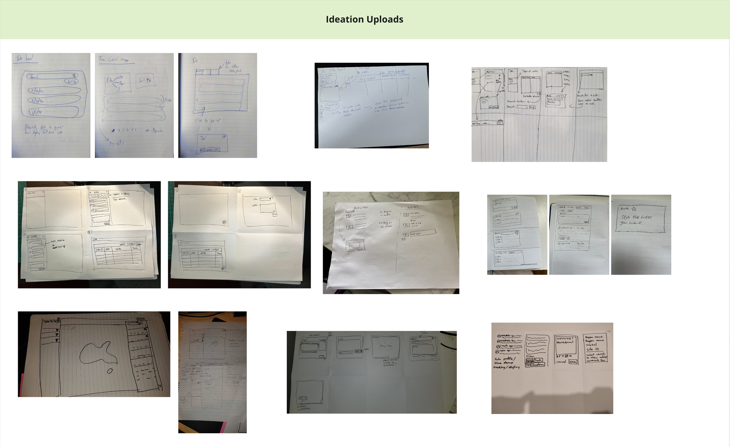

We have many good ideas, such as users making a site note on the site indicator level or popup a site note that users can move around on the map. Based on the dev team's suggestions and considering our time frame, we need to know if this feature is essential for the user. We finalised one idea that we can achieve in 1 sprint time. We decided to have a site note feature on the existing information panel. Now it's time to mock up wireframes.
Wireframes

Design A: Pop-up Panel
Pro:
More breathing space
Users can have bigger icons and fonts to look at (eligibility)
user can look at multi things, no back-and-forth clicking
Con:
An extra thing for the Dev team to build
Hard to revise back
Design B: Info panel all in one

Pro:
Keep everything in one panel
No extra build for the dev team
Con:
Space issues, smaller icons and fonts
Less content view
Need go back and forth to view content
Design C: Slack style

Pro:
Current SCATS has it
User can type notes straight away
Flexible less space
Con:
Could be hard to build
Its separate from the note panel
UI workflow
What’s in the design/delivery scope
User reading notes
The user edit & saves notes
User delete notes
User add notes
The user wants to see an overview while editing notes
Notes reach max capacity
Empty states
Delay spinner
Error message-when notes cannot be updated
Error message-when notes cannot be loaded
Workflow of User editing and saving notes

1.1 User logged in to the Map and saw site ID”63043” is red. The user needs to click the site and investigate.

1.4 Single click on the noted user wants to edit. The note will open. The user can see the entire note and edit or delete it.
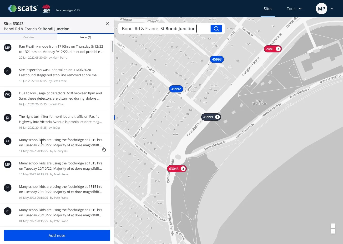
1.7 The new time stamp and editor’s name will be replaced after saving the note.

1.2 The information panel pops out from the left-hand side. The user has an overview of the site.

1.5 User click edit button, then they will able to edit the note.

1.3 User clicks the “notes” tab next to “Overview”. They will see a list of existing notes.

1.6 After editing the note with basic text style, the user can click “save” to save the change or “ Cancel” to exit without saving the note.
Other scenarios

Add note: User click “Add note” button on the bottom, basic functional text editor will appear.

Error Message: When system error, user will be given error message.
Empty state: when there is no notes in the site.

Delete note: After user click the delete button, there is one more step to confirm the action.

Spinner: when network or system slow, note section cannot be seen.

Maximum note reached: When max 10 notes are reached, the user will receive this message.