
Service Victoria Mobile App Design System Refresh
Project Overview
Role: Senior UI designer (Design System)
Design team: Audrey Xu, Chelsea Woodford, Richard Daniels
Time: 2 months (4 Sprints)
Tools: Figma, Jira, Confluence
Project description: As a product designer specialising in UI, I have been working with the App design team and development team to improve the design system. The revised design system aims to make the components consistent and easy to use. Some of the key focuses of the VIC Design System include Grid System, Typography, Icons (Glyphs), and Colour.
The Pain point
System Problem: The design system is hard to use due to the need for a source of truth. The design system has yet to be maintained and updated correctly for years. The inconsistency components crossed designs.
Design Problem: It hasn't been honoured iOS human interface design guidelines or material guidelines, creating friction between devs and designers. Some of the fonts need to improve readability and accessibility.
Opportunities
It's the chance to create the appropriate design process and simultaneously clean up random design components. It is also an opportunity to create consistency and efficiency in the design system and improve the accessibility and readability of some of the details.
It would be a perfect opportunity to converse with the Dev team and rebuild the relationship if it weren't there. Sharing the design expertise and knowledge with the rest of the group informed the design decisions with stakeholders, ensuring the continued growth and maintenance of the design system.
Spacing and Grid
The initial design system has no grids, so they have been working and building components without a grid system! Most components are 10px or 20px based, and design tokens have not been introduced.😱
The challenge here is to design the grid system and build spacing tokens with the dev team. However, they want to keep most of the design components, avoiding redesigning them. So I designed 4px based grid system with 20px margins and four columns of fluid width. We only focus on mobile apps because tablet apps are off their roadmap.

Typography
The most challenging part of the design system, and there are a few things I need to consider when designing this typography.
Need to improve readability and accessibility. However, not too much distribution from the current design.
Need to meet Human interface and material design guidelines.
Build efficiencies for both designers and developers when refining reusable components.
Allow fonts to scale to leverage platform accessibility functions.
Builds consistency across products.
What's my approach:
Assessed the Victoria government's design system, Ripple, to ensure we aligned with their typography approach.
Aligned with iOS and Material structures to ensure our set would work across the platform.
Reviewed and cleaned up our current typography styles, honouring previous design decisions and improving accessibility where possible.
What's the process:
Get internal approval to update the new type styles.
Replace existing design system typography styles.
Create typography guidelines by illustrating the intended usage.
Communicate changes to designers through teams and release notes.
Update design system components, screens, and documentation.
Make sure styles are linked across the latest design files.
Support developers with setting up a token approach to typography styles (i.e. make one change, and it changes across all instances of the app).
Collaborate with developers and stakeholders as we update
Continuously evaluate, test and refine, addressing any issues that may arise during implementation.

This is the current typography. Too many duplicate font sizes and some of them are too small. It’s confusing and doesn’t create any value in the design system.
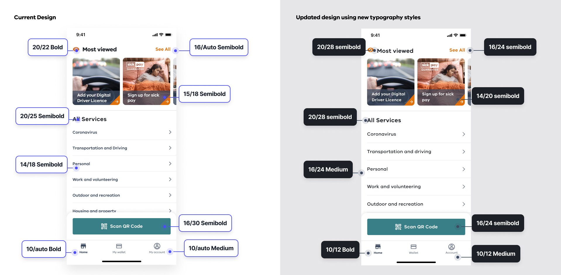
This is the comparison of current design & improved design.

Example of the typography
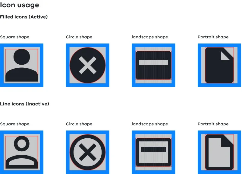
Icons (Glyphs)
Some original icons were designed to look like Google material icons, and some were downloads from Material Library. However, the size and weight are different for each icon. Based on this client's budget and staffing, I suggested them to have an adaptive approach. Use free resources like Google Material Symbols:
It has 2,891 accessible glyphs.
It supports Figma and also provides developer guides.
Easy plug-in variety of options to match design needs.
Google allows using their icons across the ios platform and has cross-platform adaptation documentation.
What's my approach:
Assessed the government's design system, Ripple, to ensure we aligned with their icon approach.
Aligned with ATMO web design system.
Build icons suitable for both ios and Android (Quick and coast cost-effective).
What's the process:
Define which icons are currently used, and archive those not used for the past six months.
Set up design considerations and rules.
Set up image formatting documentation for devs.
Resize all the icons to the correct size and weight.
Work with the dev team.

Colour & Contrast
The original colour plate choice is acceptable. The core brand colour is Orange #FA9100, which is cool because many brands use orange as their Primary colour, like Bank ING, Bank West and Everyday rewards card. However, if the orange button with a small font will cause accessibility issues, I have seen orange buttons with 16px font everywhere throughout the app.
What's my approach:
The solution is to increase the font size on some of the components so it will pass the AAA standards.
Rework the colour combination before changing too much in the original design system.
Archive the colours hasn’t been used.
What's the process:
Define which component needs to increase the font size and which must change the colour combination.
Set up Colour contrast accessibility charts.
Achieve the colours haven't been used in any components.
Set up an example of how to use this colour.
Test with customers who are orderly or have Visual impairment.
Set up tokens with the dev team.

As you can see, the colour has mostly stayed the same to pass AAA standards. We only increased some font sizes and tweaked the colour combination, giving the layout more visual hierarchy and breathing space.
Elaboration Process Improvement
The next topic I want to talk about is the elaboration process. We faced many challenges when working from low-fi design to high-fi design; then, we realised we needed an exact process.


